 |
| You will never know the difficulty uploading this took. |
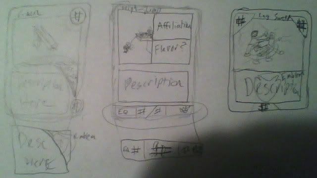
So, I did say long ago that I had not only intended on having a slightly working prototype of a game made by the end of the year, but that I had an idea in mind. And since then, it's more or less been complete silence on it as I took it behind-the-scenes as it were, and simply started working on it mostly in my own time. And mostly in my own mind with tonight being not the first, but one of the few times I sat down and tried to concept something out for it. Obviously tonight was the card design and layout (click Here for slightly bigger version) and with very general and broad strokes, since the mechanics are more or less still up in the air. There are definitely two systems in place at the moment and they both offer their own strengths and weaknesses, so I have to pin down just which is the best of the two.
The two systems, which I imagine explaining prior to describing the cards above and the thought behind them is a good idea, are pretty simple and tried-and-true ones. The first, which was more or less what the cards above were designed in mind with at the moment, is a cost system as most card-based games have. All cards feature an Equip cost and a Use Cost (Why all? You'll see.) which is admittedly partially taken from Metal Gear Ac!d as an idea, but it's not like it'd be the first nor last. Ideas come from everywhere, etc. etc. The gist of Use and Equip costs is that they make you think a bit more 'tactically' since you can keep a card to use if you think it will be useful or it might just be worth preparing by equipping it so you can chain it with something else. Of course, not everything can be chained, but blah blah, details. And the second idea is to simply have a number of actions a turn (2, for instance) wherein you can play a card however you want, but you only get two. You can equip two cards, equip one and use one, move with both, etc. The advantage here is the easier nature of it, since you don't have to track numbers and costs, but game balance is a concern, since with no cost or anything, some cards could easily become OP, all things considered.
That in mind, let's get a little bit into the cards and start peeling back what is simply visible to explain what it means. Start with the left-most card that is, unfortunately, a little washed out because it's lightly sketched and glare happens, but I figure you can see it well enough. It offers pretty much the simplest design that sort of looks like what most other cards design themselves after. The Use cost in the upper right corner with the name of the card being up there as well, under that is the illustration, and under that is the description. I have part of the description box taken up by a little space for an emblem that shows what affiliation the card is for (of the four 'Factions' as well as unaligned) for flavor and under that is the Equip Cost which is possibly a bit out-of-place. But that is the point of doing roughs, of course, to figure this sort of stuff out and place things in a better place.
I know we're not supposed to play favorites, but I do think the middle card is the one I like the most in this group of three. It's a fairly different spin on the classic design since it compartmentalizes the upper square usually dominated by the illustration for the card. Since I want Affiliation to play a part in the game (I'm thinking bonuses for using cards affiliated with the faction you're playing, which is the simplest), it features that pretty chiefly and allows for flavor text and/or a reminder as to what bonus it might innately offer if I go that route. (I'm thinking the Movement-based Faction gets an additional 1 to move for such cards and the like) Then the Description is afforded a reasonable amount of space above the bottom bar which has a spot for Equip Cost, Movement Value, and Use Cost respectively, keeping everything fairly neatly in its own place. The main problem is that it does cramp the illustration a bit and vertical space is generally trickier to work with than horizontal.
The last card, which kind of seems like a variation of the first is also a pretty strong contender. Use and Equip Costs are featured at the top of the card on opposite sides, flanking the illustration and name, forcing it to the center rather than left to right. The illustration still has plenty of room even with the triangles cutting into the space, the description has ample room, and the Affiliation Emblem watermark offers that distinction that I want to be very apparent. The only issue with it is that it's a fairly basic design, and I honestly don't know where to put Movement Value, so I sort of just tossed it in the center at the bottom. It has the benefit of keeping the 'triangle' theme, not only making a triangle with the other numbers, as well as them being cased in triangles themselves. So it does have a bit of flow, which I like, but it still seems a bit lacking and/or thrown-together.
I just wanted to show that off to show that there was, indeed, work and/or thought being put into the project. While I'm sort of doubting it being even a little bit workable by the end of the year, it's nice to have something a little tangible made up. And writing this out has made it a lot more focused in my head as to how to rethink and/or refine certain aspects of the game as a whole, as well as the designs I thought up. Of course, this is just one aspect of it that I have to cover, the other two being the characters/factions (which I have in mind, just haven't concepted them out because I am terrible with forms, as is obvious) and the ideals in place for making some maps to actually play the game out with and help me keep it balanced. Everything sort of has its own facets which I'm realizing very slowly, and thinking out those facets will likely be the biggest challenge of the process on the whole.
No comments:
Post a Comment