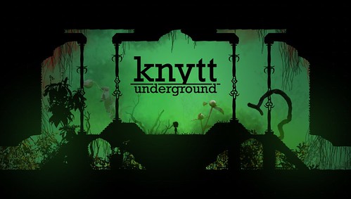
Knytt Underground went up as yesterday's Playstation Plus freebie in the Playstation Store Update and I have to admit that I've been eying it for a while, but not enough to pick up the demo for the game since there wasn't a file size attached to it in the Vita store and I am considerably lazy at looking that kind of thing up. I figured it's well worth the shot at the lovely price of 'free' and so I tested out my shiny, fixed internet by downloading all 657 MB of it. "What's the worst that could happen?" I posited. I've already played Braid, so I've seen about the lowest depths of 'artsy-fartsy' and pretentious that one could expect from a Puzzle-Platformer, and while I didn't expect anything of that sort from Knytt, it was technically possible as most things in the world are. But I expected something better than that, something fun and challenging, possibly engaging, with a gorgeous art style to pull it all together. That....is not quite what I got.
The game -is- quite beautiful to look at for the most part, and is no doubt enhanced by the Vita's absolutely wonderful screen. Backgrounds are lush and vibrant, where the actual traverse-able areas are generally black, but not distracting from what you're -really- looking at. The area where the actual look of the game falls is the character design and, unfortunately, it falls hard. Sprites of humanoid things are generally only shown in portraits for conversations (that barely occur) but when they happen, they're so jarring from the beauty surrounding it, that you find yourself wondering how they managed to end up in the same game. To tell the truth, they're not....horrible, they're just juvenile and they clash tremendously with the style of the rest of the game itself.
Those characters are unfortunately made less appealing thanks to the writing that is at once barely-there and over-stays its welcome. Knytt Underground unfortunately suffers from a thought process that it has to be everything at once - beautiful and charming, funny yet serious, simple yet challenging - and, as with most things that attempt this, it fails spectacularly at doing everything by muddling everything together and accomplishing nothing. When the characters finally do open their mouths, it's usually to spout some groan-worthy 'witty' comment or to attempt to further the equally groan-inducing 'story'. Here is the story, idly, as it's told over three chapters. Mi (the main character) can't talk. She is going to get picked to save the world and can't refuse it because she can't talk. Then that happens and the last chapter is trying to save the world. That's it. Everything else is superfluous and painfully so at that. The entirety of Chapter 2 is spent looking for a key to doors that just open themselves when you can't actually find the key. (Spoiler alert: The key is actually in the fucking pocket of the fairy you're working with and you're -told- this about an hour before you figure it out.)
Nothing about the game screams inspired or enchanting, nor is any of it particularly good even. It's....mediocre in the literal sense. Not very good, but not bad either. It's an effort, that much is for sure, but it's an effort that just didn't go well in the end product. The designs and the 'humor' that the game tries to have only drag down what's already a fairly uninteresting game to play. The controls are simple enough and the map design is a bit forced - you'll figure out over the three chapters that you're on the same map for all three, just that you start in different places for each one. So all those things you see in Chapter 1 that you just can't get to, well, you'll come back to them in what is a poor attempt to making it Metroidvania-esque, I assume. This is, of course, all sprinkled in with power orbs that are only present in a handful of areas that cause changes in your movement when you use them - orbs that attempt to introduce the actual challenge to the game and...well, succeed, I guess. Not very well, however, which might as well be the mantra for the game.
Knytt Underground is just....confusing, really. It doesn't know what it wants to be and thus tries to be a little bit of everything to no real success. Or, rather, the first two chapters are like this. Of a three chapter game. I'm going to go out on a limb and suggest that chapter three isn't going to introduce all sorts of game-changers that elevate it to something beyond what I think of it currently. That's unfortunate, and perhaps I will be proven wrong, but I'm so convinced that I'm honestly not sure if I'm going to continue with Chapter Three - I could be playing other things, after all. Things I have fun with. Things that don't make me roll my eyes when the screen goes white and the self-insert narrator faux-cheekily says "...and then there was an explosion.", presumably with an implied hand wave with jazz fingers. Of course that's not a thing I do often.....but that's not to say I never do it.
seriously, a thing tells Rob (the fairy) that the key is in his fucking pocket three times that is the stupidest fucking thing

Not that it matters, but if you never went back to Knytt Underground after quitting with Chapter Two, you have to run around the huge open world and the fun then is in the exploration. There's little plot after that, Knytt has always been about the exploration.
ReplyDelete